
Welcome to Illustrating Westeros, Mr. Youll. Your work has delighted readers across the world and inspired many artists to follow in your footsteps. What can you tell us about your own footsteps that you took when you decided you wanted to become an artist, and about those who helped to inspire your creativity?
For as long as I can remember I've always been interested in art and creating art. As a kid, I was inspired by the art in comic books like 2000 AD, Vulcan and Valiant, notably, since these had more of a science fiction flavor to the stories. Movies like Forbidden Planet, War of the Worlds, The Day the Earth Stood Still, and others like them fueled my fascination for science fiction at an early age. It seemed I could never get enough of it. It was this love of the genre that really inspired me to choose a career in science fiction illustration.
My brother, Graeme, was also one of my biggest influences in an indirect way. I was about 10 years old, and I noticed he never seemed to be without a book to read. They were all science fiction and fantasy books. I loved the covers on the books he was reading and looked at them with wonder. I was pretty much hooked on the art. From then on I was always in the book stores, mostly to look at the great covers on Sci-Fi and fantasy books.
I was inspired by quite a number of artists over the years, but when I was young I loved the work of Chris Foss, Tim White, Peter Elson, Peter Andrew Jones, and Chis Moor, as well as other British Sci-Fi artists. My favorite school teacher, Denis Fox, taught art and loved science fiction also. He would bring in art books by Chris Foss and H. R. Giger and have us mesmerized with the art. He saw a great deal of enthusiasm and promise in me, so he encouraged me to enroll in to art school. By the time I got to art school, I was noticing a number of American book covers on books in UK book stores. Frank Frazetta, Greg and Tim Hilderbrant, and Boris Vallejo became important inspirations. Fantastic art that continued to fuel my love for the genre.
I studied technical and advertising illustration at University, subjects that gave me good skills and a grounding in drawing and painting. My plan was to take this new knowledge and apply it to becoming a book cover illustrator. It was a forgone conclusion, really, and a logical choice. I loved the genre and publishing was a place my art would make sense. So I put together a portfolio of work and trotted off to London, where most of the art agencies are located in England. One art rep, Val Edwards, who happens to be the wife of the artist Les Edwards, advised me and my twin brother, Paul, to show our work at the World Science Fiction convention that year being held, as luck would have it, in England. It was 1987. At this time I had very little money, my twin brother, Paul, and I were working as artists for a Cathedral in Durham. The job paid very little, but enough to purchase convention tickets, hanging space, train fare and hotel accommodations. I took about 5-6 paintings to show, and Paul took about the same amount.
It was my first World Con, and still remains my favorite and most influential convention. The convention was very important for me since I was able to meet a lot of the artists that had influenced me, see original paintings, and was a perfect place to show off my work for the first time. Many publishing houses were there from both the UK and the U.S. Shortly after exhibiting there, I was getting calls from publishers in New York for my first professional jobs. It all happened really rather quickly. I've now been illustrating for almost 30 years.
As a traditional artist, what is it that you find personally fulfilling about this medium? And getting into the details of your technique, how do you go about creating a piece from start to finish?
I've worked in multiple mediums over the years. From pastel to gouache and watercolor, acrylic and oil to now digital. The kind of medium I choose is really to make the final illustration as good as I can get it. I've never been hung up on what medium my illustrations were created with, but by using the best methods and techniques for the end result. My earlier work was painted in gouache, but I moved over to acrylic as soon as I started being hired for professional work. It was a more versatile medium to work in, and I found I could achieve better results. After a few years of working in acrylics, I was seeing problems with how I wanted my illustrations to look. A number of exceptional artists were all working in oils at the time and I could see what my limitations were as far as a particular feel to the art I was doing. So I moved to oil paints in the mid 90's and painted traditionally up until around 2001. I was also doing some cover art for mystery and thriller type books at this time and was loath to paint the subject matter traditionally. Digital had been around for a few years and I decided to try it. I bought a computer, loaded it with software and took to it very quickly. I was still painting my Sci-Fi and fantasy covers traditionally, but doing other work digitally. Over time I found a number of publishers wanted different looks after seeing years and years of traditional art come in. Fueled mostly by the editorial staff, some publishers were becoming less and less interested in paintings and were asking for something else. So I found myself doing different looks with the computer to meet the needs of the publishers I was working for.
My own evolution as an artist has gone from very photographic back to a more traditional feel, but all created digitally now. Mostly because of the demands of the clients. Nowadays, it’s tough to make a living painting traditionally in the illustration field. Between the multiple changes, additions, and the time restrains, creating illustration on a computer was a necessary step forward in my growth and survival as a commercial and cover artist.
You are a legendary figure in the fandom due to your work on the original cover art for the A Song of Ice and Fire novels. Had you known of or read the ASOIAF books prior to working with the author, and what was it about these books that fascinated you as an artist and as a reader? Did you emerge from reading with any favourite characters?
I heard through the grapevine, before I was considered for the cover, that the publisher thought A Game of Thrones a very important manuscript and a great deal of effort was being made to promote the book.
For starters, I didn't create the first cover. The first book was released in hardcover and had a graphic representation of a throne on it. Because the publisher thought the book was an important novel, they wanted what they termed a 'big book' look for the cover. Something that went beyond the usual genre cover at the time, no standard fantasy art, lots of foil, and big type. I'm sure everyone is familiar with that cover by now. The book stores hated the cover and the sales were not great. They fell quite a bit short of expectations. So the publisher decided to change the package and go with a new look for the paperback cover. The editor and lead art director were looking for a very specific style for the book, that wasn't overly 'cartoony' looking. The art director also wanted something realistic that would appeal to the fantasy genre. They felt I had the right balance of realism and feel for the style of George R. R. Martin's writing and hired me.
Take us inside the process of working on these covers: Did you have significant input and feedback from Martin and/or Bantam’s staff or were you given more or less free rein to select the scenes and develop your own ideas? What were your main goals for the covers in terms of their artistic appeal and textual representation?
I worked with the art director on all of the covers I illustrated. We consulted with each other and discussed ideas for covers extensively. There was very little input by George on the cover art other than seeing the art when it was finished. The Editors and even the President of Bantam were consulted regarding the cover art and viewed preliminary sketches and ideas along with the art director. When you have a book series that's considered important, the number of people who get involved can be extensive. The goal of each cover was to capture the feeling and tone of the writing while illustrating key characters from the books. We wanted a realistic approach to the style of painting and something that reflected how George wrote the stories.
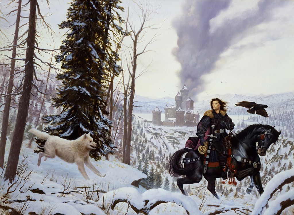
Turning to the specific covers, you capture a very stately Jon Snow on horseback with his direwolf Ghost running alongside and the castle of Winterfell in the distant background for A Game of Thrones. Why do you think a strong Northern theme was important in terms of representing Volume I of the saga and how did this informs your compositional choices and the various details included in the scene?
There was a full manuscript for Book One, and after reading it I discussed using Jon Snow on the cover with the art director. There are quite a number of great characters in the book, but there was something about Jon Snow that really resonated with me as a character to represent the first book. As an artist you're always looking for something that sparks an idea that will make for an eye-catching cover. Jon's black outfit and his black horse made a striking visual set against the snowy background. The burning castle was symbolic of the seat of power and the conflicts between the various houses in the story. The paperback sold very well and the publisher felt they were on the right track as far as how to represent the book series. No more graphic thrones. This proved to be a good decision as A Game of Thrones was finally noticed by the fans and the book sold amazingly well. When Bantam Books decided to reprint A Game of Thrones in hardcover, my art was put on the cover in a panel with the original graphic throne from the first cover behind the title . . . combining both pieces of art.
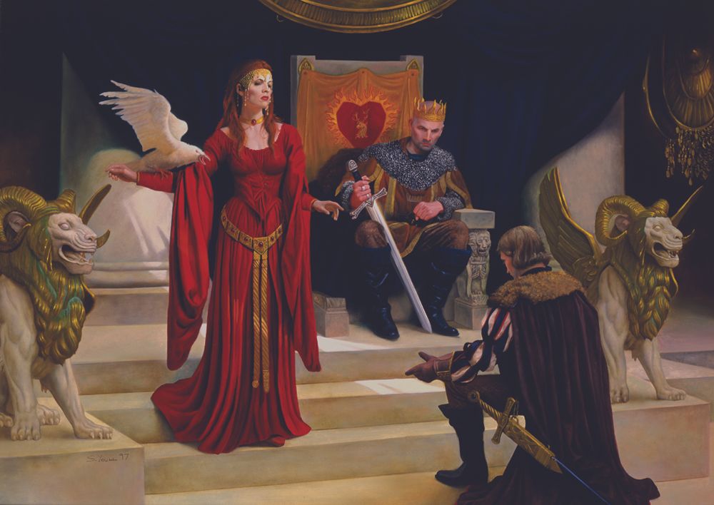
The cover for A Clash of Kings presents quite the visually striking contrast to Volume I, where we move away from the winter stronghold of the Starks and into the domain of the Red priestess Melisandre and King Stannis Baratheon. What can you share about your artistic process for this image, looking specifically at colour and symbolism?
A Clash of Kings is my favorite of the covers I created for the series. Since I had illustrated a landscape for Book One, I wanted to change things up and illustrate an interior scene. At this point, the design of the books had changed and the hardcover went from a full bleed piece of art to a panel, the big type punch, with foil and embossing. Again another 'big book' feel, but this time using a full color fantasy illustration. On Book 2, the publisher wanted something special for the cover design. It's one of those perfect occasions where the art works beautifully with the design. It's one of my favorite cover designs and overall package I've ever worked on for a series of books.
As for the cover art, I wanted to illustrate a strong female character from the story this time. Stannis is the king, but I wanted the composition to reflect the power and influence Melisandre has over him. There were a few symbolic themes I added to the art from the story. Ravens have always been a harbinger for ill omens, loss and death, and being white was a perfect theme for winter is coming and worked in the art perfectly.
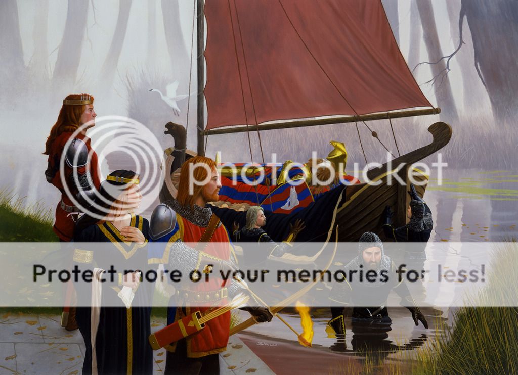
A solemn mood dominates the cover for A Storm of Swords, as the Tully family prepares the funeral custom for their dead patriarch, Hoster Tully. What were some of the challenges in painting this scene as it relates to communicating each character’s role and keeping the sombre tone intact? Further, given the later events of the Red Wedding, were you at all influenced by that tragedy to go with a more mournful subject for the cover?
The Red Wedding was a dramatic and bloody scene in the book, but not suitable for a cover for obvious reasons. I had illustrated Stannis of the House Baratheon on the previous book and a great deal of A Storm of Swords centers around the Starks. After finishing the manuscript, the tragedy and downfall of the Stark family was something I wanted to focus on.
I was drawn to the funeral scene as soon as I read it. I was looking for something that evoked a sense of sorrow and loss, which are themes that run through the novels. I couldn't believe my luck when I read it and found my cover. It gave me the theme I wanted to portray and seemed fitting as a precursor to the fate of the family. I took some license when illustrating the scene and reimagined it so it would work for the cover illustration. Focusing on Catelyn and Robb for the main characters, I built the scene around them.
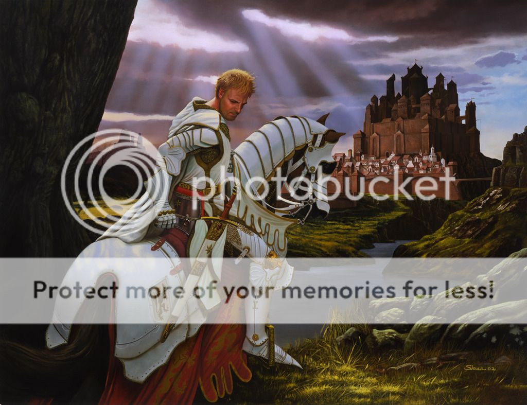
Besides being a rarely depicted Jaime Lannister scene, your cover for A Feast for Crows has the distinction of also being the one that wasn’t used in the eventual release of the novel. We consider it an unfortunate missed opportunity as it’s quite an extraordinary piece both for its atmospheric quality and the pensive Jaime it highlights. What message did you wish to communicate to readers via this cover and what place does it hold in your overall estimation of your creative achievements for ASOIAF?
The cover for A Feast for Crows has an interesting history, regarding why cover paintings are never used or in this case put to one side while the book is still in the process of being completed. I had completed the painting quite a few years before the book was finished. The dust jackets were actually printed two times for promotion, anticipating the book would be finished. Between those years, the publisher decided to change the look of the covers to broaden the books’ appeal to a non-genre audience. So the covers changed in appearance, no full color art and lots of foil, which I also worked on creating the graphic art. I know from quite a number of emails that many fans were not happy with that decision. Since they would never get a full set of the books with the same design on the cover.
As far as my original cover goes, Jaime was always a fascinating character to me, and a perfect choice to illustrate and represent the Lannister family for the fourth book in the series. There was no manuscript to read, but Jaime stood out for me. At this point in the series, we see a change in Jaime's personality. He is conflicted about who he is. After rescuing Brienne of Tarth and losing his sword hand, there was a change to his character.
I wanted to express that with how I painted him for the cover. I deliberately posed him to suggest a very thoughtful feeling. His head bent down to suggest the conflict and change I felt his personality was going through.
After finding out the covers were being redesigned and the art wasn't going to be used for the fourth book, I was quite dismayed. It would have been one of my favorite covers for the series.
You also had the opportunity to work on a cover for A Dance with Dragons, not as part of the original commission for Bantam but as a separate piece “to continue the look of the series” as indicated on your website. What was it like to work on depicting this very intense and powerful imagery, and would you be interested in doing more cover art for the final two proposed books in the series?
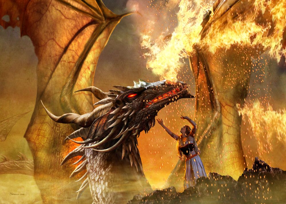
I created the cover art for A Dance with Dragons after I was contacted by a Greek publisher called Anubis via Compupress S.A., that had purchased all of the previous covers for their editions. After expressing that they did not like the new look of the redesign, they asked if I had anything suitable that would work for their edition. I didn't have anything that I could either alter or use, so I decided to do a new piece for them. Since Dragons was in the title, having a dragon on the cover was obvious, and since I hadn't illustrated one of the key characters from the story yet, it gave me a perfect opportunity to illustrate Daenerys Targaryen with the largest of her dragons, Drogon.
I wanted to show Daenerys in a pose that suggested a kind of dance she plays out with Drogon. The dragons are still pretty wild and largely untamed at this point and she doesn't have control over them. She's reaching up to it, in a gesture of love while trying to console it. The dragon in all its rage after being chained up, lets out a blast of flame. The scene was pretty intense as far as I remember it, and gave me a perfect opportunity to capture the power and elegance of both characters.
As far as doing a painting for the last two books when they finally arrive (I'm waiting with bated breath like everyone else out there), it seems more than likely that I will do more cover art for them even if it's only to have a complete matching set in a foreign language.
As someone with a long and prominent career, what advice would you give to fan artists hoping to do official artworks and book covers for fantasy/science fiction authors?
The advice I like to give anyone pursuing a career in publishing these days is you better love what you do, and wear a thick skin! When you're working for a publisher, you are doing a cover for them, and on many occasions you will be asked to constantly rework or completely change an image that suits the publisher, even when you think it's perfect for the book as is. Hence the saying—wear a thick skin!
The types of covers I'm seeing published these days are quite a bit different from the ones I created ten to fifteen years ago. The goal of publishers is to broaden their market and sell more books. And that may well be to the behest of the core genre fans. The classic fantasy cover could well be a thing of the past soon and be something unrecognizable as Sci-Fi or fantasy.
Everything has its time and change is inevitable. And publishers like to try new ideas. So know your market and look at what is being published in terms of the images on these books. Look at current books for what is selling, as well as classic covers that you may love. Putting up a website is very important. These days that's your portfolio. In the past there was always access to art directors to show them your work. Nowadays it's easier to just email some of your works to an art director than get an interview with one.
The good news is, there's still quite a lot of traditional covers being asked for and many writers who self-publish still want that classic look that identifies the book as a genre book to its base core of readers.
Personally, I remember being inspired by the spaceships on covers by Chris Foss, Peter Elson and Chris Moor, forty years ago. I'm still painting spaceships thirty years later from when I started. Sci-Fi and fantasy are as popular today as it's always been. I think there's a bright future ahead of you and whole new universes to discover and illustrate. An university lecturer once told me, "When you venture out into the world, you run the risk of being hired. After that, it's up to you."

What current projects do you have in the pipeline that can be shared with our readers?
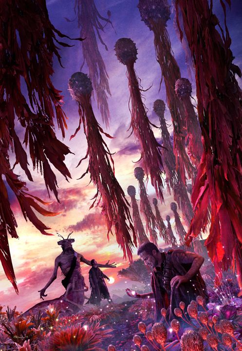
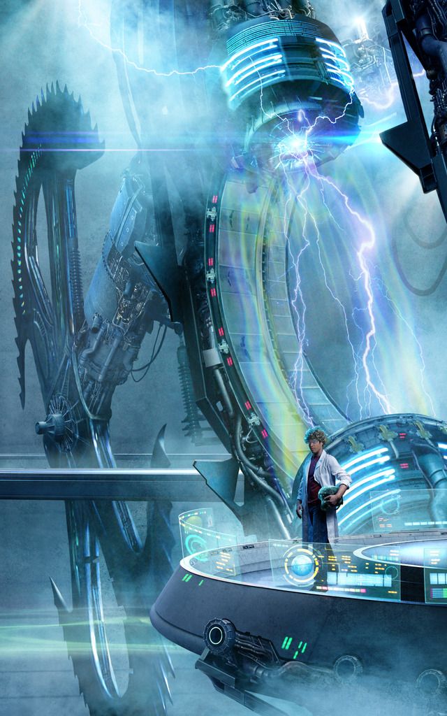
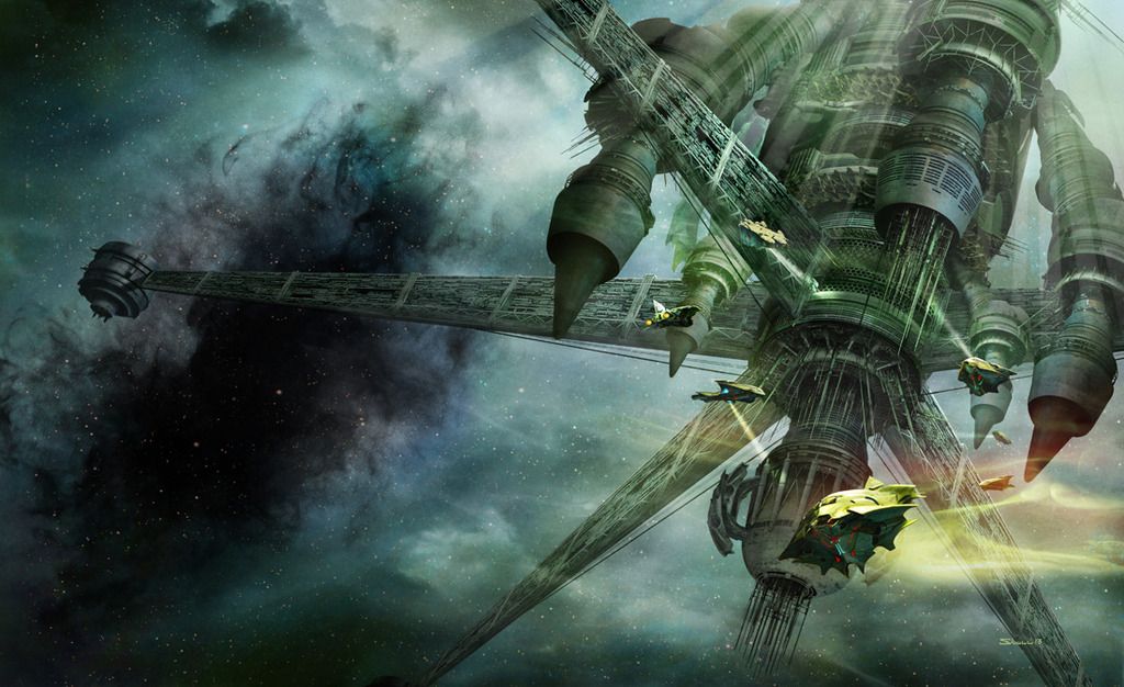
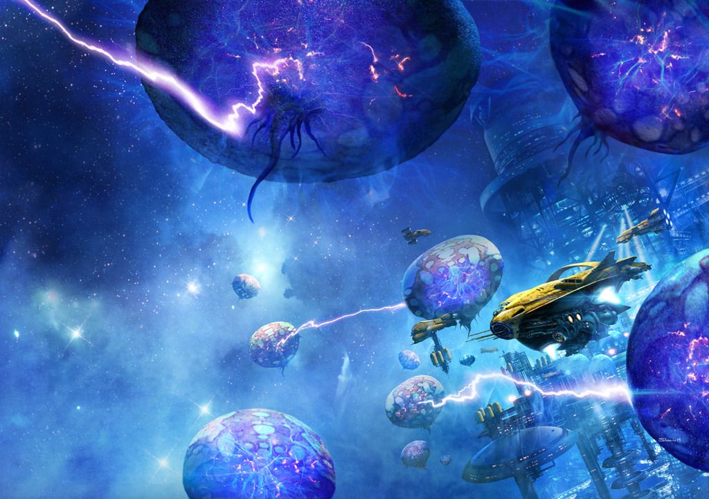
I just completed the final book for Kevin J. Anderson's Saga of Shadows series, Eternity's Mind, and also the final in the long running Dune saga—Navigators of Dune—for Kevin J. Anderson and Brian Herbert. A book series very dear to me. Right now, I'm currently working on a project for IBM that's very hush hush and that's super cool, and hopefully in the near future I can disclose some of the work I'm doing for that. I have a number of projects lined up with various publishers for all sorts of books, from romance novels and thrillers to Sci-Fi and fantasy books. I've also been working with a number of writers who are self-publishing their books, and have found that to be quite rewarding. I've got a lot on my plate to keep me busy.
Sci-Fi cover titles: Hellhole Inferno; Forging the Axe; The Dark between the Stars; Eternity's Mind; Navigators of Dune; A Mighty Fortress; Prelude to Foundation; An Experiment with Gravity; Mentats of Dune.